Class Content I >Modeling with mathematics > Building your mathematical toolbelt
2.3.4
Prerequisites:
|
A tool that is used heavily in all the sciences is representing a relationship on a graph. When you learn to create graphs in math in school, you are typically showing the graph of a function -- a relationship between two variables (usually x and y) and that's pretty much the end of it. But in science we'll be graphing many pairs and often we'll have many different graphs representing the same physical situation. As a result, this tool can give you multiple views of the same situation, each graph highlighting a different aspect of what's happening. It's like picking up a real object and looking at it from different angles, rotating it, turning it over, and looking at it with different lighting. Looking at a situation using different graphs helps make our understanding of it richer, more coherent, and make more sense. What's particularly useful is blending reading graphs with the story tool to see how and what parts of the physical story are told by a graph.
|
 |
Let's get the basics down and work an example.
The basics:
Although you have had lots of experience both in creating and in reading graphs, in my experience many students are sloppy in their handling of graphs, in part because they haven't learned how valuable graphs can be as tools to help analyze and make sense of a complex situation. Here are a few hints how to keep your graphing tool sharp and polished.
- Draw your graphs carefully
- Label your axes
- Remember how to plot and read individual points
- Use professional conventions
- Learn to read slopes and areas from a graph
Draw your graphs carefully
Many students are sloppy when drawing graphs if they are not doing them to hand in for an assignment. They draw their axes as curvy lines, aren't careful about making their axes perpendicular, and sketch graph lines as if they were doodling rather than trying to draw a scientific diagram. This is like trying to carve a roast beef with a butter knife! You don't have to pull out a ruler and protractor every time you want to draw a graph, but be careful about drawing straight lines, making right angles look like right angles, and marking scales evenly and appropriately.
The point is that some patterns in a physical situation are MUCH easier to pick up on when you see it in a graph or another visual representation. In a carefully drawn graph the pattern you are seeking may just jump out at you. In a sloppy one, it will be hard to find and drawing the graph will just be another tedious task instead of a way to a solution.
Are carefully drawn graph is a valuable tool to help you understand a physical situation.
Label your axes
In school math classes you often only dealt with a single graph of the form, y =f(x). There were two related variable -- x and y. Even in science classes, you would often be shown or create for yourselves a single graph to represent a relationship or a data set. It was therefore OK to refer to the horizontal axis as "the x axis" and the vertical axis as "the y axis".
In this class that's going to cause you a mess of trouble. In this class we will often be using multiple graphs of different things at the same time to describe a physical situation. You might be plotting the horizontal displacement of an object as a function of time. In that case, the horizontal displacement might be the vertical axis and the time the horizontal axis. You then could find yourself saying such confusing sentences as "We have x on the y axis and t on the x axis." And you might be trying to compare graphs of x vs t, v vs t, a vs t, F vs t, F vs x, and more, all at the same time. (See, for example, Sticky carts.)
So we'll call the traditional "x axis" the horizontal axis and the "traditional y axis" the vertical axis. (The real technical terms for these are "the abscissa" and "the ordinate" respectively. We will NOT use these terms. ) In order to keep the graphs you draw as useful tools, be sure to label your axes! We're going to have so many graphs for the same situation that not doing so will get you totally confused! (Besides - not doing so might damage a person relationship, according to Randal Munroe.)
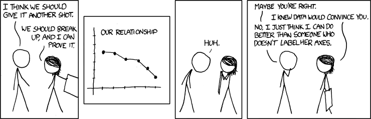
Randall Munroe, xkcd.com/833/
Remember how to plot and read individual points
|
This seems trivial. Everyone taking this class knows how to do this. For example, if we are plotting the velocity (v ) as a function of time (t ), to plot the velocity 5.0 m/s at a time 7.5 s, we go along the time axis until 7.5 and draw a perpendicular straight up (dashed line). We then go along the velocity axis until 5 and draw a perpendicular straight over (dotted line). Where they meet is our point on the graph that represents (v,t) = (5 m/s, 7.5 s). Of course if we have a point on a curve, we can run this procedure backwards to find the coordinates of a point on a curve.
While this may seem obvious, I have seen students fail to call on this knowledge time and time again when asked to draw or read a graph. Of course, drawing careful perpendiculars and marking the scales are necessary for this to work.
|
 |
Use professional conventions (or class conventions)
For some reason, a few decades ago school mathematics teaching picked up the convention of drawing arrowheads on the ends of axes to indicate that they go on forever. Sometimes this convention was extended to the curves that represented functions — arrowheads were drawn at the ends of the curve to indicate that it goes on forever. If you have picked up this habit, please break it. There are three reasons to do this:
- The professional convention used in scientific publications does not use arrowheads on the ends of axes or graphs.
- Many of our functions (and even our coordinates) do NOT go on forever, but only represent a limited range of variables.
- We want to use a different convention for pedagogical purposes.
A challenging thing to learn handle in using math in science are signs. Signs will be used in this class to specify directions and to distinguish gains from losses. Sometimes, when we are plotting a graph we will want to emphasize which direction is the positive direction on our axis. Although usually these will be "up and to the right", we will learn that we are free to choose our axes and that it is sometimes convenient to choose them at an angle or upside down. So we will sometimes put an arrowhead on the positive end of an axis (never on the negative end!) to remind you which way is +. Look for it!
Learn to read slopes and areas from a graph
In your calculus class you certainly learned that the derivative of a function is represented by the slope of its graph and that the integral of a function is represented by the area under its graph. While this may have seemed mildly interesting (or not at all interesting) facts, in this class we will use them as powerful tools to relate position, velocity, and acceleration or potential energy and force, for example. Check out the follow-ons at the end of this article for details.
An example: Position and velocity glasses
A simple example that shows how different graphs can help us make sense of a physical situation by looking at it in different ways is to consider a ball rolling on a track over a hill. A sketch is shown below. The horizontal position of the ball will be described by the coordinate "x" shown underneath the diagram. (Note the arrowhead denoting which end of the x axis is the positive side.)
 We'll assume a highly simplified situation. The ball is rolling smoothly and we can ignore any resistive forces that might be slowing it down; that is, over the distance we are looking at, if there were no hill the ball would continue at a constant speed (at far as we can tell).
Here's the story of the event. When we start watching (when t = 0), the ball is a bit to the left of the origin and is moving at a constant speed. When the ball gets to the hill, we expect it to slow down as it climbs the hill, then continue at a constant slower speed along the flat. When it gets to the end of the flat portion of the hill, it starts downward and speeds up. When it gets to the flat part on the right, we expect it will again continue at a constant speed. Although you may not yet know the physics principles that tell you this, we might guess that whatever speed it lost going up the hill, it gained back coming down the hill. (This is correct given our assumptions.)
Now let's see how to represent this story in two different graphs.
On the left, we've "put on our position glasses" and have plotted where the ball is along the x-coordinate as a function of time. We've marked five regions of time to match the graphs with our story. On a position-time graph, when an object is moving with a constant velocity, it is changing its position at a constant rate. The time graph of that position is a tilted straight line with a larger tilt representing a larger velocity. Let's read what the graph tells us.

Region I describes from the start of our story until the ball reaches the hill. It starts at t = 0 a bit to the left of the origin so it starts at a negative value. It's moving at a constant speed when we start looking so the graph in region I is a tilted straight line, increasing its position coordinate at a constant rate. Region II describes the times when the ball is rolling uphill. We know its slowing down so it's curving down a bit. Region III describes the times when the ball is rolling on the flat part at the top of the hill. It's moving at a slower constant velocity so it's again a tilted straight line, but it's not tilted as sharply. Region IV describes as the ball comes down the hill. It's speeding up so its tilt is tilting more upward. In Region V the ball is again moving at a constant speed — and the same speed we started with. So its graph is a straight line tilted upward with the same slope as in region I.
Now let's take off our position glasses and put on our velocity glasses — the graph at the right.
The velocity graph represents the different regions very differently from the position graph! In this case, we focus on the speed of the ball and how its changing. In region I the ball moves with a constant positive speed so we have a constant positive graph. In region II the ball is slowing down so the value of the velocity gets smaller. (We don't know how without applying some physics principles, but for a constant slope of the hill a constant slope on the velocity graph seems like a good guess.) In region III the ball is moving at a constant speed, but smaller than the one it started at. In region IV it speeds up again, and in region V it is again going at a constant speed equal to the one it started at.
Notice how different these two graphs look! Just compare region I. The position graph tells you the value of the coordinate is continually increasing. You're focusing on where it is. The velocity graph tells you the value of the velocity is not changing. You're focusing on how fast it's going. In the follow-ons it shows (reminds you) how to construct the other graph if you only have one — to infer the velocity graph from the position graph and vice versa.
Follow-ons:
Joe Redish 12/27/17
Comments (0)
You don't have permission to comment on this page.